
Watch trailer
Course at a glance
| Release date | 4/2/2015 | |
| Level | Intermediate | |
| Runtime | 1h 20m | |
| Closed captioning | N/A | |
| Transcript | N/A | |
| eBooks / courseware | N/A | |
| Hands-on labs | N/A | |
| Sample code | Included | |
| Exams | N/A |

Course description
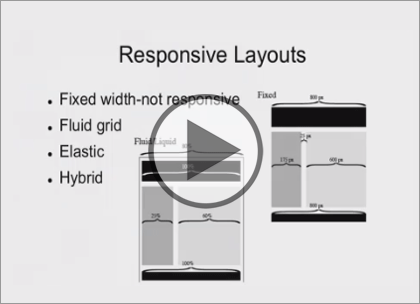
Building Responsive Websites will become easier after you take this 4 part learning series. In these courses you’ll get an introduction to the theory of a responsive website. You look at items that will need to be considered before you start building your site. Then you’ll see how to design and build mobile first sites, with more smart phones on the market than desktop computers this is a very important consideration. Next you’ll see how to layout your web pages, how to use a grid, apply media queries and breakpoints. Then you’ll learn how to apply the correct fonts and typesetting. Then what to show and hide in a website and why you need to adjust the web page to various screen sizes. Then you’ll see what a flex box is, use responsive images, create navigation lists, and finally testing your page.
Prerequisites
This course assumes familiarity with using HTML and CSS. This course is part of a 4 part learning series. The courses should be taken in the following order; Building Responsive Websites: Introduction; Building Responsive Websites: Page Layout; Building Responsive Websites: Type & Screens; and Building Responsive Websites: Finishing Touches.
Meet the expert

Our Creative Design courses are presented by experts from Wiley Publishing. Wiley is a global provider of knowledge and knowledge-enabled services that improve outcomes in areas of research, professional practice, and education. They are the publisher of award-winning journals, encyclopedias, books, and online products and services.
Course outline
Finishing Touches
Flex Box (18:05)
- Introduction (00:10)
- Three-Column Layout (04:14)
- Fix Footer (04:38)
- Flex Box Rule (04:51)
- Flex Box Column Sizes (04:01)
- Summary (00:10)
Responsive Images (23:40)
- Introduction (00:10)
- Responsive Background Images (05:54)
- Background Color (02:06)
- Insert & Define Images (05:18)
- Responsive Images (01:53)
- Using Large Images (03:34)
- Image JavaScript (04:32)
- Summary (00:10)
Navigation List (20:16)
- Introduction (00:10)
- Navigation List (05:16)
- Define Link Information (04:11)
- Horizontal Navigation (05:55)
- Styling Horizontal Navigation (04:33)
- Summary (00:10)
Testing (18:18)
- Introduction (00:10)
- Dropdown Menu (05:05)
- Menu Toggle (05:14)
- Testing Screen Size (04:44)
- Testing without Dreamweaver (02:53)
- Summary (00:10)